In the world of interior design, few styles capture the essence of peace and functional beauty quite like Japandi. This increasingly popular aesthetic is a seamless fusion of Japanese minimalism and Scandinavian hygge, bringing together the best of both worlds. At its heart, the Japandi style is defined by its clean lines, uncluttered spaces, and an unwavering commitment to natural materials. But what truly sets the mood and defines the atmosphere is its exquisite use of colour – specifically, the Japandi colour palette.
Embracing a spectrum of earthy tones, muted neutrals, and natural hues, the Japandi colour palette is designed to evoke a sense of calm, warmth, and grounded simplicity. It’s about creating spaces that feel both refined and inviting, where every shade contributes to a serene, cohesive environment. If you’re looking to infuse your home with this tranquil elegance, understanding and applying these colours is your first step. And with ryy.com's AI design tools, you can easily visualize how these beautiful palettes will transform your own rooms before you even pick up a paint brush!
The Essence of the Japandi Colour Palette: Serenity Through Simplicity
The philosophy behind Japandi colours is deeply rooted in nature and the principles of wabi-sabi (finding beauty in imperfection) and hygge (creating comfort and coziness). This isn't a style for bold, vibrant statements; instead, it thrives on subtlety, depth, and the interplay of quiet shades. The goal is to create a backdrop that allows textures, forms, and natural light to shine, fostering a sense of peace and mindfulness.
Embracing Neutrals: The Foundation
The bedrock of any Japandi scheme is a strong foundation of soothing neutrals. These aren't just plain whites; they are nuanced, sophisticated shades that provide warmth and depth without overwhelming the senses. Think of them as the canvas upon which the rest of your design will unfold.
- Off-Whites and Creams: Softer than stark white, these shades add a gentle warmth, perfect for walls and larger furniture pieces. They reflect light beautifully, making rooms feel airy and expansive.
- Light Greys and "Greige": From cool, almost ethereal greys to warm, inviting "greiges" (a blend of grey and beige), these provide a contemporary edge while maintaining softness. They pair exceptionally well with natural wood tones.
- Muted Beiges and Oatmeals: These warm, sandy tones bring an organic, grounding feel. They connect strongly to natural fibres like linen and wool, enhancing the cozy aspect of the style.
When selecting your foundational neutrals, consider the undertones. Warm neutrals (with yellow or pink undertones) create a snugger, more inviting feel, while cooler neutrals (with blue or green undertones) lend a more crisp and contemporary vibe. Both work within Japandi, depending on the specific mood you aim to achieve.
Grounding Earth Tones: Adding Depth and Connection to Nature
Once your neutral base is established, the Japandi colour palette introduces a selection of carefully chosen earthy tones to add subtle depth, interest, and a direct connection to the natural world. These are typically muted, desaturated versions of colours found in nature, ensuring they harmonize rather than contrast.
- Warm Browns: From light tan and caramel to richer chocolate hues, browns are essential. They echo natural wood, clay, and soil, providing a grounding, organic feel. Incorporate them through furniture, pottery, or accent textiles.
- Muted Greens: Think sage, olive, moss, or dusty eucalyptus. These greens evoke tranquility and growth, bringing the calming presence of nature indoors without being overtly botanical. They work wonderfully as accent pillows, ceramic glazes, or subtle wall colours.
- Soft Blues: Dusty blues, slate blues, or even a hint of muted denim can introduce a sense of serene calm reminiscent of water or sky. These are best used sparingly to maintain the warm, earthy balance, perhaps in a throw or a piece of art.
- Subtle Terracotta and Clay: While more vibrant terracotta might seem too bold, muted versions of this earthy red-orange can bring warmth and a handcrafted touch, especially in pottery or tile accents.
- Charcoal and Deep Grey: Used sparingly, darker greys or almost-blacks provide a striking contrast and definition, often seen in minimalist furniture frames, lighting fixtures, or graphic accents. They add a sophisticated edge.
The beauty of the Japandi colour palette lies in its restraint. You don't need many colours; rather, you need the right colours, used thoughtfully to build a layered, harmonious scheme. Want to see how a rich sage green would look against a greige wall in your living room? Upload a photo of your space to ryy.com and use our AI tools to experiment with different Japandi colour combinations instantly!
Applying the Japandi Colour Palette in Every Room
The versatility of the Japandi colour palette means it can be adapted beautifully to any room in your home, creating a consistent flow of tranquility.
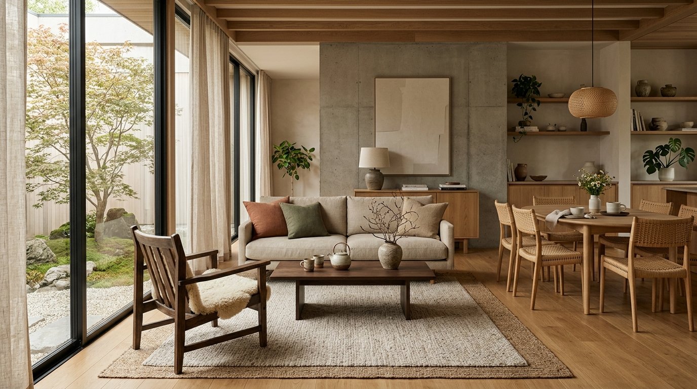
Living Room: A Hub of Calm
The living room is often the heart of the home, and a Japandi approach can turn it into a serene sanctuary. Start with light, airy neutrals for walls and large furniture like sofas. Imagine an off-white or soft greige backdrop, paired with a low-slung sofa in natural linen or a subtle grey fabric. Introduce warmth with a light oak coffee table or shelving unit. Accents can come in the form of muted green or dusty blue throw pillows, a handcrafted ceramic vase, or a large, textured rug in an oatmeal hue. A statement chair in a darker wood or charcoal fabric can provide a grounding contrast. Remember, simplicity is key; let the quality of materials and the subtle interplay of colours speak for themselves. You can easily experiment with different wall colours and furniture finishes using ryy.com's AI design visualizer for your living room!
Bedroom: Your Tranquil Retreat
For the bedroom, the Japandi colour palette truly excels at fostering relaxation. Prioritize soft, soothing hues that promote rest. Walls in a soft cream, light grey, or even a very muted sage green can create an enveloping feel. Bedding in crisp white linen, natural beige, or a subtle stripe adds texture and comfort. A low-profile bed frame in light wood (like ash or birch) is quintessential Japandi. Introduce gentle accents with ceramic bedside lamps, a wool throw in a warm brown, or a single potted plant. The absence of clutter, combined with these calming colours, transforms your bedroom into an ultimate haven. See how a Japandi colour palette transforms your bedroom on ryy.com, experimenting with different bedding and wall colours.
Kitchen & Dining: Functional Beauty
In the kitchen and dining areas, the Japandi colour palette focuses on natural functionality and clean aesthetics. Think matte finishes for cabinets in light wood tones (like pale oak or birch), or perhaps a soft greige or off-white. Countertops often feature light concrete, pale stone, or even white quartz. Black or dark grey accents for hardware, lighting fixtures, or bar stools provide a sophisticated contrast. Open shelving showcasing minimalist ceramics in earthy tones reinforces the aesthetic. For dining, a simple, solid wood table paired with minimalist chairs in wood or dark metal creates an inviting space for gathering. Fresh green herbs or a simple potted plant add a touch of living colour. Design your dream Japandi kitchen with ryy.com's AI tools, experimenting with cabinet colours and countertop materials.
Bathroom: A Spa-like Sanctuary
Transform your bathroom into a serene, spa-like sanctuary using the Japandi colour palette. Focus on clean lines and natural materials. Large format tiles in white, off-white, or light grey create a seamless, expansive feel. Wood vanities in a light finish, or a minimalist floating vanity, are perfect. Incorporate natural stone elements, such as a pebble mat in the shower or a small stone dish for soap. Minimalist black or brushed nickel fixtures provide a subtle contrast. Soft linen towels in natural beige or a muted green, along with a simple ceramic vase holding a single branch, complete the tranquil picture. With ryy.com, you can easily envision new tile patterns and vanity colours for your bathroom.
Beyond Paint: Bringing the Palette to Life with Materials & Textures
While paint is crucial, the Japandi colour palette extends far beyond wall colours. It's about how these colours are expressed through the materials and textures you choose. In a minimalist design style, texture becomes the primary way to add visual interest and depth without relying on busy patterns or excessive ornamentation.
Natural Woods
Wood is paramount in Japandi design. Opt for light-toned woods like oak, ash, birch, or pale maple. These appear in flooring, furniture (tables, chairs, bed frames), shelving, and even decorative accents. Their natural grain patterns and warm hues contribute significantly to the earthy colour scheme.
Woven Textures
Introduce tactile warmth with woven materials. Rattan, bamboo, jute, and sisal can be found in rugs, baskets, lampshades, and occasional furniture. Their natural, un-dyed states perfectly align with the Japandi colour palette and add an organic, handcrafted feel.
Organic Fabrics
For textiles, choose natural, breathable fabrics. Linen, cotton, wool, and hemp are ideal for bedding, throws, curtains, and upholstery. Their slightly imperfect, slubby textures add character, and their natural colour variations blend seamlessly into the Japandi aesthetic. Think of undyed wool, soft greys, and muted beiges.
Ceramics & Stone
Handmade ceramics in earthy glazes (matte white, soft grey, muted green, or terracotta) are perfect for vases, dinnerware, and decorative objects. Natural stone like concrete, marble, or slate can be incorporated into countertops, sinks, or accent pieces, adding a sense of permanence and grounding. Their inherent colour variations contribute to the palette in a subtle, sophisticated way.
By thoughtfully layering these natural materials, you create a rich, tactile environment that feels welcoming and harmonious, even with a restrained colour scheme. The absence of bold colours allows the beauty of these raw materials to truly shine.
Practical Tips for Mastering Your Japandi Colour Palette
Ready to bring the Japandi aesthetic to your home? Here are some actionable tips:
- Start with a Neutral Base: Begin with your walls and large furniture in soft whites, creams, light greys, or muted beiges. This creates a calm canvas.
- Choose 2-3 Accent Colours: From the range of earthy browns, muted greens, or soft blues, pick a couple that resonate with you and use them sparingly to add gentle interest.
- Layer Textures, Not Patterns: In place of busy patterns, rely on the varied textures of natural materials – smooth wood, rough linen, chunky knit wool, delicate ceramics – to create visual depth.
- Embrace Natural Light: Keep windows minimally covered to allow abundant natural light to stream in, enhancing the airiness of your chosen palette.
- Bring in Living Plants: Greenery is essential. Choose simple, elegant plants like snake plants, ZZ plants, or Ficus lyrata in minimalist pots to add a touch of natural vitality.
- Declutter Ruthlessly: A core tenet of Japandi is minimalism. Clear out unnecessary items to allow your carefully chosen colours, textures, and forms to truly breathe.
- Test Before You Commit: Paint swatches on your walls and observe them at different times of the day to see how the light affects the colour.
Not sure where to start? Upload a photo of your room to ryy.com and use our AI tools to experiment with different Japandi colour palettes instantly! See how a sage green accent wall looks, or try a light oak flooring against a greige backdrop – all before making any commitments.
Create Your Serene Japandi Space Today!
The Japandi colour palette is more than just a trend; it's an invitation to create a home that truly nurtures your well-being. By embracing earthy tones and natural hues, you can craft spaces that are not only aesthetically pleasing but also profoundly calming and functional. It’s about finding beauty in simplicity and creating an environment where you can truly relax and thrive.
Ready to embark on your Japandi design journey? Let ryy.com's powerful AI design tools be your guide. Experiment with different wall colours, furniture layouts, and material combinations, all within the serene framework of the Japandi aesthetic. Design your dream space with ease and confidence – your harmonious home awaits!