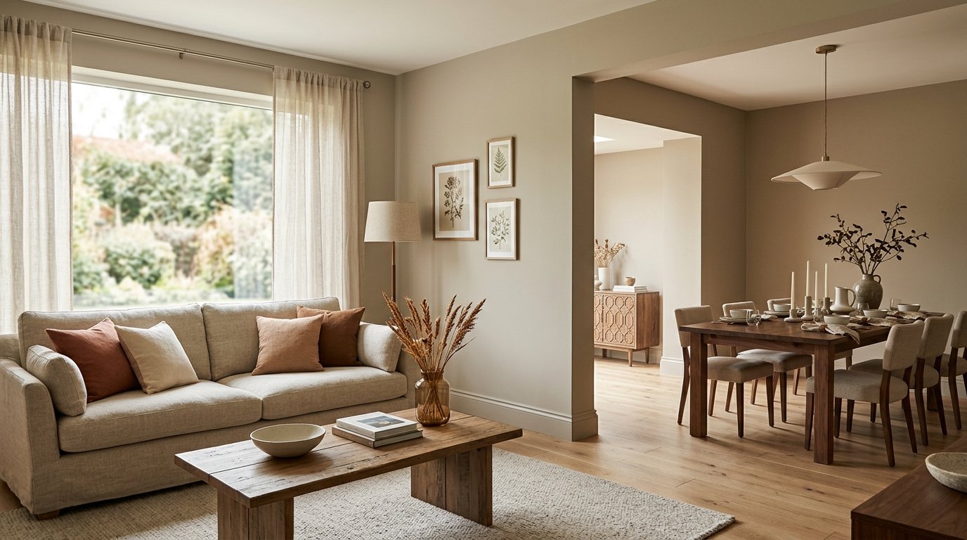
There's a reason certain colours feel like a comforting hug – they wrap your space in an inviting warmth that instantly puts you at ease. When it comes to transforming your home into a sanctuary, few choices offer the versatility, timelessness, and sheer comfort of warm neutral paint colours. Far from being "boring," these sophisticated shades provide the perfect backdrop for virtually any style, from minimalist modern to rustic farmhouse. They create an atmosphere that feels both fresh and grounded, allowing your furniture, art, and personal touches to truly shine.
At ryy.com, we understand the power of a well-chosen paint colour. While the sheer number of options can feel overwhelming, understanding the nuances of warm neutrals can empower you to make confident design decisions. Imagine effortlessly visualizing these inviting hues in your own space before ever lifting a paintbrush – that's the magic our free AI design tools offer.
The Allure of Warm Neutral Paint Colours: More Than Just Beige
When you hear "neutral," do you picture stark white or drab grey? Think again! Warm neutrals are a vibrant category, encompassing a spectrum of subtle tones infused with cozy undertones. They're the secret ingredient to creating spaces that feel inherently welcoming and full of life, rather than cold or sterile.
Understanding Undertones: The Key to Warmth
The "warmth" in a neutral paint colour comes down to its undertones. While a colour might appear beige or grey at first glance, a closer look reveals hints of other colours that influence its overall feel. For warm neutrals, these undertones typically include:
- Yellow: Creates a sunny, cheerful glow. Think creamy whites, buttery beiges, or even some greiges with a yellow tint.
- Red/Orange: Imparts a cozy, earthy, or even blush-like quality. These can be seen in taupes, some deeper beiges, or muted terracotta shades.
- Pink: Offers a soft, sophisticated, often romantic warmth. Common in subtle blushes, some greiges, or off-whites.
Understanding these undertones is crucial. A "warm grey," for instance, might have a subtle beige or yellow undertone that prevents it from feeling too cold, especially in a north-facing room. A "cool beige," on the other hand, might have green or grey undertones that make it less suitable if you're aiming for a truly inviting warmth.
Versatility and Timeless Appeal
One of the greatest strengths of warm neutral paint colours is their incredible versatility. They act as a sophisticated canvas, allowing you to:
- Anchor diverse decor styles: Whether your furniture is sleek modern, cozy traditional, bohemian chic, or industrial cool, a warm neutral wall colour will provide a cohesive and elegant backdrop.
- Highlight architectural features: Without competing for attention, warm neutrals subtly enhance mouldings, built-ins, or unique wall textures.
- Create a cohesive flow: In open-concept homes, warm neutrals can be used throughout different zones, subtly shifting in tone to define areas without breaking the visual harmony.
- Stand the test of time: Unlike trendy colours that come and go, warm neutrals offer enduring appeal, ensuring your home remains stylish for years to come.
Top Warm Neutral Paint Colour Families and Their Vibes
Let's dive into some specific categories of warm neutrals that have captivated designers and homeowners alike.
Creamy Off-Whites: The Soft Glow
If you love the crispness of white but want to avoid any starkness, creamy off-whites are your answer. Infused with subtle yellow, beige, or even a hint of peach, these shades soften the edges and bounce light beautifully, making rooms feel larger and more serene. They offer a sophisticated take on minimalism.
- Real Examples: Benjamin Moore "White Dove" (soft, slightly off-white with a touch of gray and yellow), Sherwin-Williams "Alabaster" (a very popular soft, warm white), Farrow & Ball "Wimborne White" (a rich, creamy white).
- Best for: Living rooms, bedrooms, nurseries, or any space where you desire an airy, yet comforting ambiance. They're excellent for trim work too.
Soft Beiges: Classic Comfort Reinvented
Modern beige is a far cry from the flat, one-dimensional tones of decades past. Today's soft beiges are nuanced and inviting, often with delicate yellow, orange, or even red undertones that give them depth and character. They provide an instant sense of warmth and grounding.
- Real Examples: Sherwin-Williams "Accessible Beige" (a perfectly balanced beige that leans into greige), Benjamin Moore "Manchester Tan" (a classic, sophisticated beige with green/gray undertones that can feel warm), Benjamin Moore "Navajo White" (a creamy, yellowish-beige).
- Best for: Dining rooms, studies, traditional living rooms, or larger open-concept spaces where you want a slightly more saturated neutral than white, but still incredibly versatile.
Greiges and Taupes with Warm Undertones: The Modern Embrace
Greige (a blend of grey and beige) and taupe (a blend of grey and brown, often with violet or red undertones) are the darlings of modern design. When chosen with warm undertones, they offer the best of both worlds: the contemporary edge of grey combined with the welcoming feel of beige or brown. They bridge cool and warm elements seamlessly.
- Real Examples: Sherwin-Williams "Agreeable Gray" (a hugely popular greige that leans warm), Benjamin Moore "Revere Pewter" (a versatile greige that can read warm or cool depending on light), Farrow & Ball "Elephant's Breath" (a stylish taupe with a hint of magenta that gives it warmth).
- Best for: Hallways, entryways, kitchens, bathrooms, or any space where you want a sophisticated neutral that feels current yet cozy.
Earthy Terracottas and Muted Blushes: Subtle Statement Makers
For those who want a bit more personality without sacrificing the calm of a neutral, consider very muted, earthy terracottas or sophisticated blushes. These shades bring an understated warmth and a touch of uniqueness, often evoking a Mediterranean or desert-modern vibe.
- Real Examples: Farrow & Ball "Setting Plaster" (a gentle, dusty pink with a warm, earthy feel), Benjamin Moore "Powder Puff" (a very pale, muted peach/pink), Portola Paints "Rose Dust" (a subtle, earthy rose).
- Best for: Accent walls, bedrooms, cozy reading nooks, powder rooms, or anywhere you want to infuse a soft, romantic, or grounding character.
Choosing the Perfect Warm Neutral for Each Room
While most warm neutrals are incredibly adaptable, some shades naturally lend themselves better to specific room functions and moods.
Living Rooms: Inviting & Social
The living room is often the heart of the home, a place for relaxation and gathering. Warm neutrals excel here by creating a foundational sense of welcome.
- Recommendations: Creamy off-whites like "Alabaster" for an open, airy feel; soft beiges like "Accessible Beige" for a grounded, comfortable vibe; or a warm greige such as "Agreeable Gray" for modern sophistication.
- Considerations: How much natural light does the room receive? What is the dominant colour of your largest furniture pieces? Do you want a truly expansive feel or a more intimate setting?
Bedrooms: Serene Sanctuaries
Bedrooms should be havens of peace and relaxation. Warm neutrals contribute to a calming atmosphere conducive to rest.
- Recommendations: Muted blushes like "Setting Plaster" for a touch of romance and softness; light taupes for understated elegance; or creamy off-whites to enhance an ethereal, cloud-like feeling.
- Considerations: Personal preference for sleep environment (some prefer deeper colours for ultimate coziness, others lighter for airiness), and how the colour interacts with bedding and natural light throughout the day.
Kitchens & Dining Rooms: Appetizing & Welcoming
These spaces are about nourishment and connection. Warm neutrals can make them feel clean and fresh, yet also incredibly inviting for meals and conversations.
- Recommendations: Warm greiges work beautifully with a range of cabinet colours (white, wood tones, even some greens); soft beiges for a classic, homey feel; or creamy off-whites to brighten and make a kitchen feel spacious.
- Considerations: The colour of your cabinetry, countertops, and flooring will heavily influence the best paint choice. Lighter, warm neutrals can make a kitchen feel larger and more open.
Bathrooms & Entryways: Fresh & Functional
Even small spaces like bathrooms and entryways can benefit immensely from the right warm neutral, making them feel cleaner, larger, and more welcoming.
- Recommendations: Lighter creamy whites or very pale warm greiges are excellent for bathrooms, creating a spa-like freshness. For entryways, consider a slightly more saturated warm greige or beige to make a good first impression.
- Considerations: Small spaces benefit from lighter colours to avoid feeling cramped. In a bathroom, consider how the colour will look with artificial light and reflect in mirrors.
Practical Tips for Selecting and Applying Warm Neutrals
Choosing the right paint colour is a process, but these tips will help you navigate it with confidence.
Test, Test, Test!
This is perhaps the most crucial step. A colour chip will never tell the full story. Purchase paint samples and paint large swatches (at least 2x2 feet) on several walls in the room. Observe them at different times of day – morning, noon, and evening – and under various lighting conditions (natural light, artificial light). How a colour looks in a brightly lit showroom versus your dimly lit hallway can be drastically different. If you want to visualize this more accurately without painting actual swatches, try ryy.com's free AI design tools to see the colours on your walls instantly!
Consider Your Existing Elements
Your paint colour shouldn't exist in a vacuum. Take stock of your home's fixed elements:
- Flooring: Is it warm-toned wood, cool-toned tile, or a neutral carpet?
- Cabinetry: In kitchens and bathrooms, your cabinet colour is a major player.
- Furniture: What are the dominant colours and textures of your largest pieces?
- Artwork & Textiles: How will your chosen paint colour complement these?
The goal is to choose a warm neutral that harmonizes with these elements, rather than clashing with them.
Understand Light Exposure
Natural light plays a significant role in how paint colours appear:
- North-facing rooms: Receive cooler, indirect light. Warm neutrals with stronger yellow or red undertones can help counteract the cool cast and make the room feel cozier.
- South-facing rooms: Bathed in warm, bright light throughout the day. These rooms can handle almost any warm neutral, and sometimes even a slightly cooler-leaning warm neutral will still feel comfortable.
- East-facing rooms: Get warm, bright light in the morning, then cooler light later. A balanced warm neutral works well here.
- West-facing rooms: Receive warm, intense light in the afternoon and evening. Lighter warm neutrals can prevent the room from feeling too hot or overwhelming during these times.
Don't Forget Trim and Ceiling Colors
The trim and ceiling colours are just as important as your wall colour for a cohesive look. Often, a slightly lighter shade of your wall colour (even the same paint mixed at 50% strength) or a classic creamy white for trim and ceiling can create a polished, integrated feel. For a more dramatic or modern look, you can paint trim the same colour as the walls, creating a seamless, enveloped effect.
Leverage AI for Confidence
Feeling overwhelmed by the endless paint chip options? This is where ryy.com steps in. Our free AI design tools allow you to upload a photo of your room and virtually paint it with thousands of colours, including all the beautiful warm neutral paint colours we've discussed. See how "Accessible Beige" looks on your living room walls, or how "White Dove" brightens your kitchen, all before you buy a single can of paint. It's the ultimate way to test, compare, and gain confidence in your choice.
Transform Your Home with the Comfort of Warm Neutrals
The enduring appeal of warm neutral paint colours lies in their ability to create spaces that are both sophisticated and incredibly inviting. They offer a foundation of comfort, allowing your personal style to flourish without ever feeling overwhelming. From the soft glow of a creamy off-white to the grounding presence of a rich greige, there’s a perfect warm neutral waiting to transform every room in your home into a haven.
Ready to discover the perfect warm neutral for your next project? Stop guessing and start seeing! Visit ryy.com today and use our free AI design tools to visualize your chosen warm neutral paint colours in your own space. Design with confidence, design with ryy.com!